聯系方式
歐馬騰會展科技(上海)有限公司
地址:歐馬騰數字文化創意產業園
中國?上海市閔行區都會路2058號
免費咨詢:400-6179-888
公司電話:021-51098588、52216612
客服熱線:13381815888
E-mail:global@omaten.com

do subtraction but not additions to booth design
發布日期:2015-12-24 瀏覽:478
do subtraction but not additions to booth design
When during a exhibition, the various booths already get the visitors feel boring drowned in duplicated experience, when an exhibition company inquiry for the booth design requirements to an exhibitor company,he or she might always get replied like this: ”simplicity, greatness, and internationalization”, but concurrently, in many booth design there filled too much literal show as floods, it go widely against the above requirements design trends as the good times of the booth designs strong in colors has gone away.
when to take to consider to subtract the booth design
Every exhibition booth designer know clearly that, an booth should be designed to be attractive and charming in visual to make people feel pleasant to inspire them, but there existed so many good factors that can be contributed to build a good exhibition booth, so the important problem of how arrange all these art forms flow up and basic requirements to offer best visual effect and bring good mental reactions for a exhibit booth design must be learned, as exhibition industry continues to evolves,the designing styles should follow to change, before an exhibition design, a designer should brainstorm the overall design framework, quickly figure out how to arrange the whole design space, so as to finally bring to design out a free style booth but not in a too complicated manner.
how to process the subtraction to the booth design
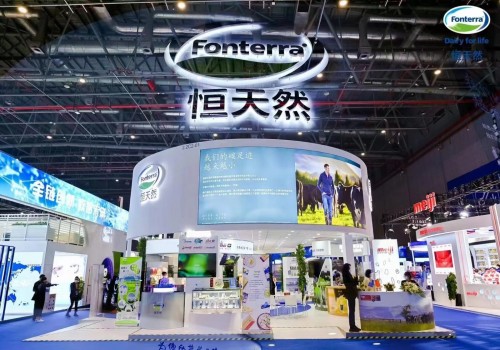
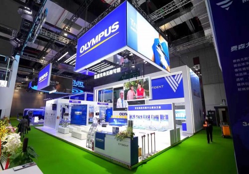
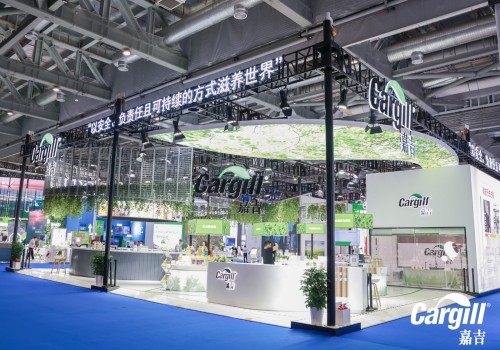
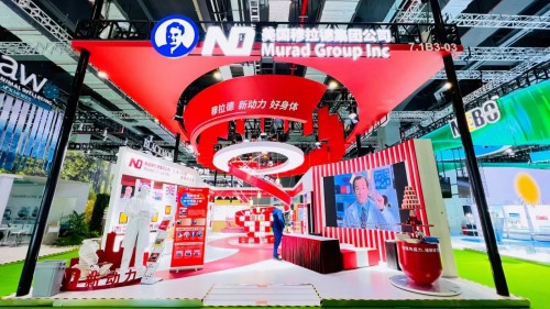
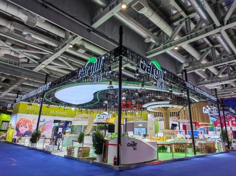
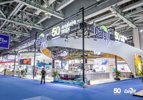
When booth design get evolved into this, then a subtraction process should be done, avoid the unnecessary elements be added to the overall design when there is no need to do so, such as the booth door header, when a big company choose to exhibit, the door header usually is the enterprise logo, or the product names, which is just a few lines or so but not detailed paragraphs of demonstrations on other things, but many exhibitor company do try this in effect to spread all the information around the all booth sides, in fact, this disturb the overall beauties of the booth meanwhile the visitor they rarely cast on all this, because the visitor would usually forwardly inquires when he or she get interested in the company desiring more in knowing more about the company details, the inquires attract they do so, is not actually the words around the booth ,but just the few line that attract them to make they feel pleasant, as the old saying goes, people communicates under the guard of their moods, it get all well if you can make customers feel good ,but get worse when at the contrary, so, too much elements or a too much complicated booth design may drop customers in bad moods, just limit all the core and necessary design elements in the booth design, too much would make people doubtful at the brand itself if it copied others to present itself, one key issue to remember in colors schemes: the main booth design can be only 3 or less than 3 types, too much would cause conflicts.
Only subtraction can fit the most possible clients requirements : the simplicity, greatness, and internationalization is always the client requirements towards a booth design for an exhibition company, a booth designer should not always follow clients to add too much in it,but to guard the clients from the overall booth aspects, and this is just what a designer should do.
原文來源于www.omaten.com


